Typesetting is an essential but often overlooked aspect of publishing, and it’s changed significantly over the years, as publishing has.
Whether you’re self-publishing a novel or designing a magazine, understanding typesetting can elevate your content’s readability and professionalism—not to mention the perceived quality of what the words are saying. That’s a whole psychological component not often touched on in these articles.
But we’re going there! Because people will judge your content by its appearance.
In this guide, we’ll explore the intricacies of typesetting, its history, and how you can master it in the modern world, along with a few hacks and tips for making the most of it.
Typesetting tips and questions answered:


Book Outline Generator
Choose your Fiction or Nonfiction book type below to get your free chapter by chapter outline!
Book Outline Generator
Enter your details below and get your pre-formatted outline in your inbox and start writing today!
CONGRATULATIONS
Thanks for submitting! Check your email for your book outline template.
In the meantime, check out our Book Outline Challenge.

What is typesetting?
Typesetting refers to the arrangement of text on a page to ensure it is legible, visually appealing, and conveys the intended tone of the content. It’s a whole art form that involves choosing fonts, adjusting spacing, aligning text, and considering design elements like margins and columns.
Many think graphic designers when they see that description, and it’s not completely off base. However, graphic designers can do typesetting as a part of their services, but the specific part of their work that deals with the text is called typesetting.
In any given design element, typesetting plays a role wherever there’s font. While you might think someone just chose a random font style and stuck it on a billboard, that’s not how it works.
Here are the primary components of typesetting:
- Typeface Selection: Choosing fonts that match the tone of the content.
- Spacing Adjustments: Fine-tuning kerning, leading, and tracking.
- Text Alignment: Left-aligned, justified, centered, or right-aligned text.
- Page Layout: Arranging text blocks, headers, and footers to optimize readability.
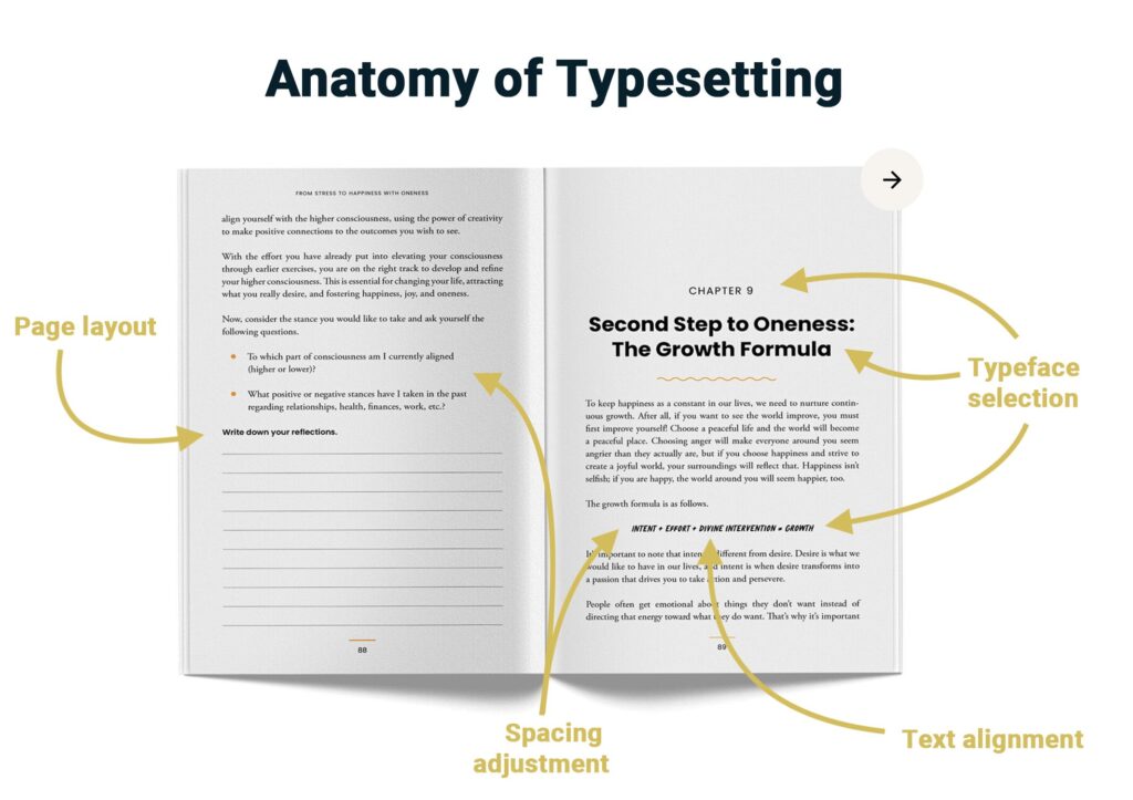
In the example above, you can see the typesetting used in a book. Many will call this “formatting“, but it goes far beyond just making sure words appear cleanly on the page. This designer specifically refers to her typesetting as interior book design.
What do typesetters do?
Every person you hire will have a different way of describing what they do. Some typesetters, for example, will prioritize certain types of design, like book formatters / interior designers or those who focus on the typesetting of websites or branding.
For the most part, though, you can expect that typesetters will do these tasks:
| Task | Description |
| Font Selection | Choosing appropriate typefaces and font sizes for the content. |
| Text Alignment | Ensuring text alignment complements the content’s purpose (e.g., novels vs. ads). |
| Spacing Refinements | Adjusting space between lines and characters to enhance readability. |
| Formatting Details | Applying consistent styles for headings, subheadings, and paragraphs. |
| Proofing | Checking for consistency, errors, and alignment issues. |
Beyond this, typesetters often collaborate with authors, editors, and graphic designers to bring the text to life.
In something like a rebrand, for example, typesetters might even create custom fonts, logos, and motion graphics. This is what happened with the Kit (previously ConvertKit) did when they rebranded, and this video is a great explanation of the nuances in choices for fonts and logos.
Typesetting examples to learn from
Nowadays, there are a ton of different types of typesetting. Text is used in so many places, we don’t even think of it as something that’s consciously chosen.
For example, there is a surgery center in the town I live in that’s sign has a certain font that feels foreboding in many ways (because yes, fonts can have sounds and feelings attached to them). This just goes to show that even building’s signs have typesetters who make specific choices, even if those choices aren’t the best.
That said, here are a few examples of typesetting you may want to keep in mind for yourself.
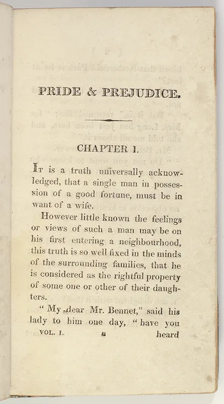
Example 1: Classic Novels
- Book: Pride and Prejudice by Jane Austen
- Features: Serif fonts like Garamond, wide margins, justified text, and balanced spacing.
- Lesson: Use traditional serif fonts for classic or formal texts.

Example 2: Modern Magazines
- Magazine: National Geographic
- Features: Bold sans-serif headings, multi-column layouts, and varied font sizes and versions (like italics) for emphasis.
- Lesson: Experiment with font hierarchy and columns for dynamic, engaging layouts.

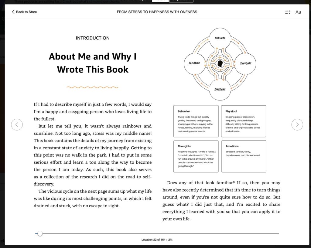
Example 3: Digital Formats
- Platform: Kindle eBooks
- Features: Adjustable font sizes, reflowable text, and clean line spacing.
- Lesson: Prioritize flexibility and clarity for digital content.
What was typesetting like before computers?
Before the advent of computers, typesetting was a labor-intensive process requiring skill and precision. While nowadays, you can learn typesetting online and even take courses to do it, you had to spend a lot of time doing so in the past.
15th Century: Movable type (invented by Johannes Gutenberg). Metal blocks of letters arranged by hand.
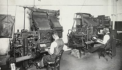
19th Century: Linotype machines: Allowed operators to type text, which was cast into metal lines.
Here’s an example of what was required of someone using a linotype machine and just how expansive the space was in order for a typesetter to do their job:
Mid-20th Century: Phototypesetting: Used photographic processes for more flexibility in layouts. Phototypesetting looked a bit different from the linotype machines. Here’s a picture of the first phototypesetting machine:

How to do typesetting in modern times
As you can see, the way this skill is done has evolved over time. Now, people can do it on their phone if they want. It’s not even that complex, and people are performing this art all across things like social media without even realizing it.
If you want to get into it, here are a few steps to get you started:
- Select the Right Software: Use tools like Adobe InDesign, Canva, or Scrivener for professional layouts.
- Choose Fonts Wisely: Pair fonts (e.g., a serif for body text and sans-serif for headings).
- Set Margins and Spacing: Ensure ample white space for a clean, professional look. Cramming too many words and letters together ends up looking messy and unprofessional, unless that is a very specific design and branding choice.
- Align and Proofread: Use alignment tools and proof for consistency. Most software will help with this, as they contain lines for equal spacing and other indicators as well as grammar and punctuation edits. However, tools like photoshop or adobe do not automatically proof copy, so be careful!
- Export for Publishing: Save in high-resolution formats (e.g., PDF) for print or digital distribution. Or make sure to preview any work you’ve done for a website before publishing it live.
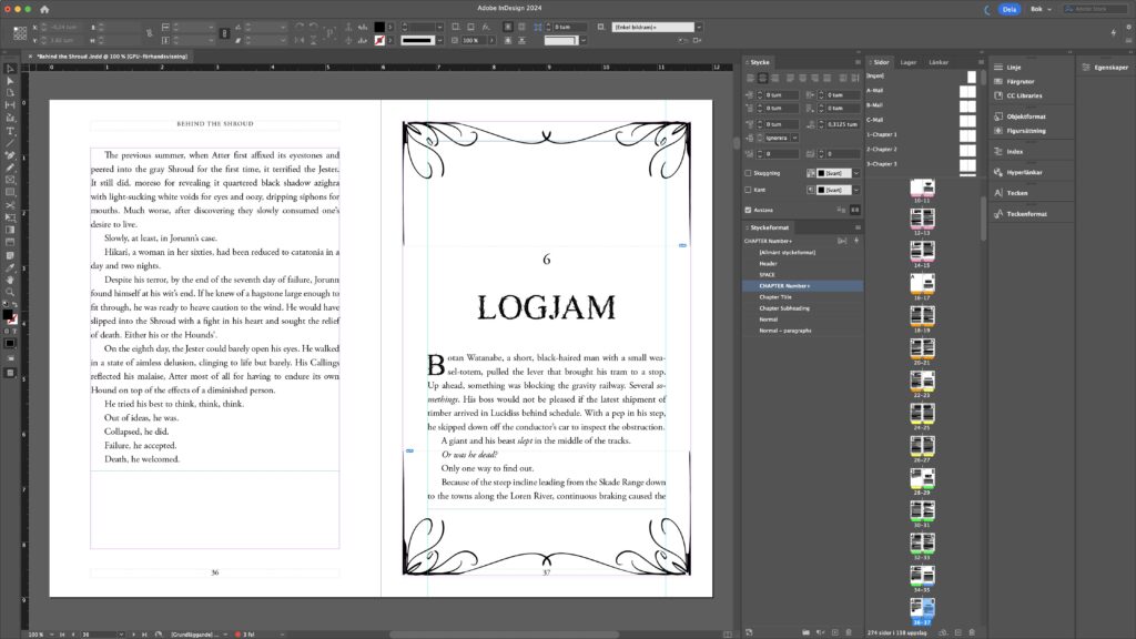
Here’s a great example of what you’ll see inside Adobe InDesign, including the margins and spacing blocks you can see.
This is an example of typesetting in a fiction book:
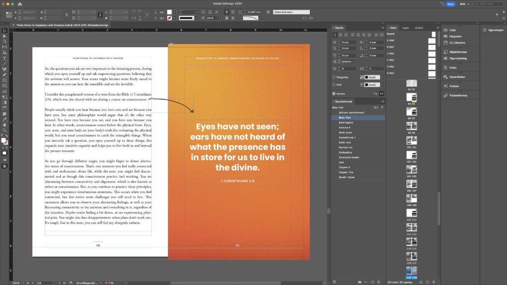
Here’s an example of typesetting for a nonfiction pull-quote section of a book:
How much does typesetting cost?
The cost of typesetting varies widely depending on the complexity of the project and the professional you hire. Oftentimes, it’s an expense that’s a part of a greater service, like book production services offered by selfpublishing.com that include cover, formatting (typesetting), editing, and even publication.
That said, you can expect to spend around these amounts for this service:
- Novel: $300-$800
- Complex nonfiction: $800-$2500
- Magazine or brochure: $500-$1500
- eBook conversion: $50-$500
Does typesetting matter for books?
Absolutely! Proper typesetting can make or break a reader’s experience, not to mention their willingness to buy the book in the first place.
Just take a look at the differences you can see in these two book options:
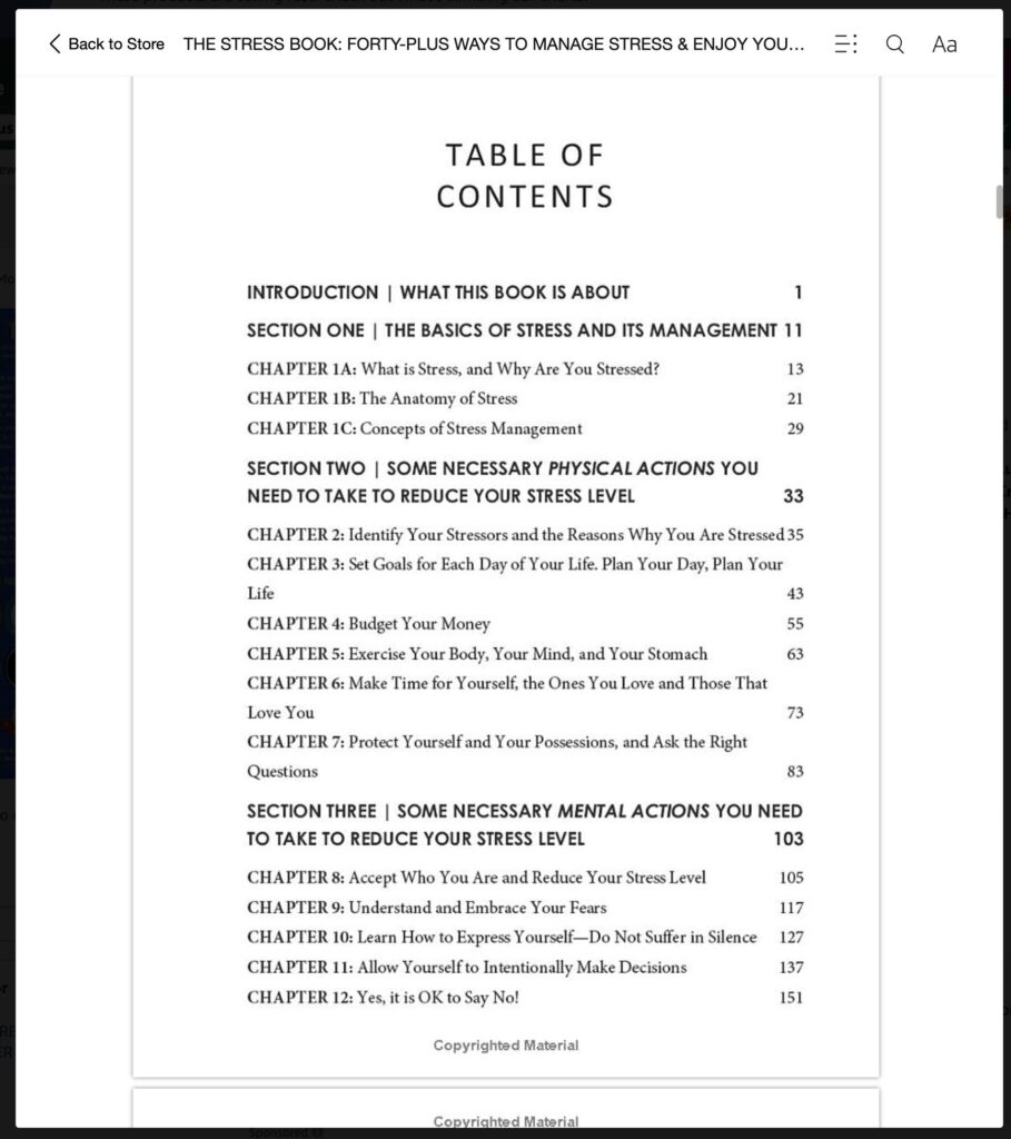
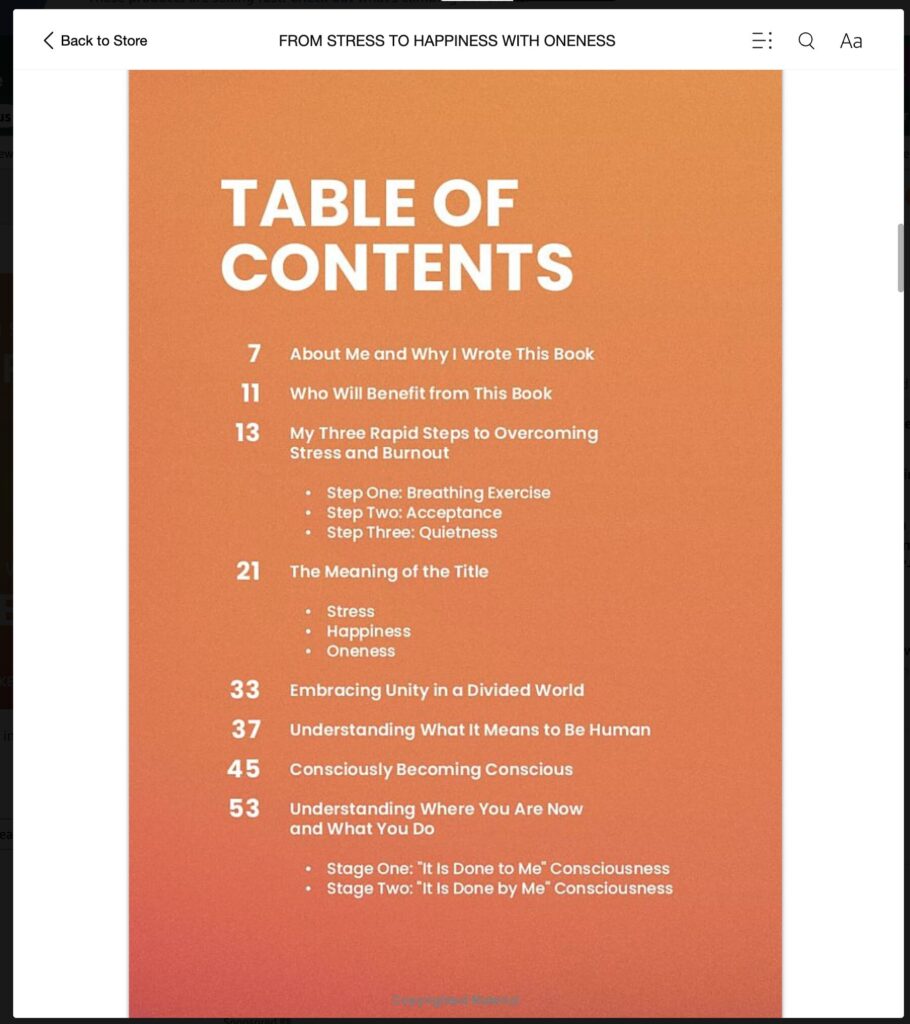
Which book given the topic about stress are you more likely to buy when you use the “read sample” feature on Amazon? Probably the one that looks the most well put together and professional. This is why it matters so much. Even before a reader has your book, they are forming an impression of the content of the book.
Plus, it matters in more ways too:
- Improves readability: Clear, well-spaced text is easier to read.
- Enhances professionalism: A well-typeset book conveys quality.
- Influences engagement: Readers are more likely to stay engaged with clean layouts.
Consider the difference between a professionally typeset novel and one with cramped margins and inconsistent fonts—it’s night and day.
Do I need to hire a typesetter for my book?
Hiring a professional typesetter can elevate your book, but it depends on your goals and resources. You do not have to do anything, really, and there are even writing softwares like NovelPad that will export a perfectly useable ebook version.
But if you want to go the extra mile, then hiring can help.
Here are a few more tips to keep in mind.
When to Hire a Typesetter:
- You’re publishing a print book and want a polished, professional finish.
- Your book has complex layouts (e.g., cookbooks, academic texts, or illustrated works).
- You lack the time or expertise to do it yourself.
- You don’t know how branding of the type forms can affect the target audience you attract.
When to DIY:
- You’re publishing an eBook and are comfortable using tools like Kindle Create or Vellum.
- Your project has a tight budget, and you’re willing to learn typesetting software.
- You’re okay with having a simplified layout due to your lack of design expertise.
The typesetting of a book can make a huge difference, as it does in just about everything else! Next time you get a piece of mail, visit a certain website, or go to a grocery store, pay attention to how the typesetting is used in various ways. You might just learn a few things on your own!


Book Outline Generator
Choose your Fiction or Nonfiction book type below to get your free chapter by chapter outline!
Book Outline Generator
Enter your details below and get your pre-formatted outline in your inbox and start writing today!
CONGRATULATIONS
Thanks for submitting! Check your email for your book outline template.
In the meantime, check out our Book Outline Challenge.

Typesetting FAQ
What’s the difference between typesetting and formatting?
Formatting focuses on applying general styles to text (e.g., font, size), while typesetting is more comprehensive, including alignment, spacing, and overall layout design.
Why is typesetting important?
Proper typesetting improves readability, enhances the professionalism of a publication, and ensures that the content communicates its intended tone effectively.
What software is used by typesetters?
Common tools include Adobe InDesign, Vellum (for books), Microsoft Word (basic typesetting), and LaTeX (academic and scientific documents).
What’s the difference between kerning, tracking, and leading?
Kerning: Adjusting space between individual letters. Tracking: Adjusting space across a group of characters. Leading: Adjusting space between lines of text.
How long does it take to typeset a book?
It depends on the complexity. A simple novel may take a few hours to a day, while a technical manual or illustrated children’s book may take weeks.
What fonts are best for books?
Serif fonts (e.g., Garamond, Times New Roman) are best for body text. Sans-serif fonts (e.g., Helvetica, Arial) are great for headings or modern designs.
Do publishers provide typesetting services?
Traditional publishers usually handle this part of the process. For self-published authors, typesetting is often an additional cost.
What are common typesetting mistakes to avoid?
Using too many fonts. Poor alignment or inconsistent margins. Overcrowded text or excessive white space.
How do I test if my typeset is effective?
Print a sample page and review it for readability, alignment, and aesthetic balance. Share it with test readers for feedback.
What happens if my text doesn’t fit well on the page?
Adjust font size, leading, or margins, and consider rephrasing text to reduce word count without sacrificing clarity.
What’s the difference between doing this for print vs. digital?
Print requires fixed layouts with precise margins, while digital layouts must be flexible to accommodate various devices and screen sizes.
What’s the best way to learn typesetting?
Take online courses (e.g., on Adobe InDesign or LaTeX). Study well-designed books and documents. Practice using typesetting software.
Can typesetting affect sales?
Yes, of course. Well-typeset content enhances professionalism and readability, making readers more likely to recommend or purchase your work.